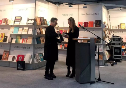
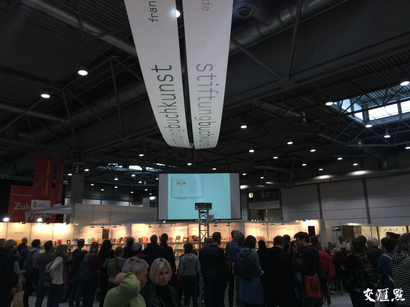
3月16日,“2018世界最美的书”在德国莱比锡颁奖,来自南京的著名平面设计师潘焰荣,因设计的书籍《茶典》荣获“世界最美的书”站上了代表世界书籍艺术设计最高荣誉的领奖台。
Nanjing designer Pan Yanrong, who designed the book Tea Canon, took the award of "The Most Beautiful Book in the World 2018" in Leipzig, Germany, Mar. 16.

潘焰荣领奖
据悉,由德国图书艺术基金会主办的“世界最美的书”评选已有近百年历史,每年一届,年度获奖图书会亮相当年莱比锡书展、法兰克福书展,并在世界巡展。
The Stiftung Buchkunst has been holding the annual competition and exhibition of best book designs from all over the world in Leipzig since about 100 years ago.

获奖人合影
“世界最美的书”组委会今年共收到来自全球33个国家和地区的参评作品600余件,其中,参选的中国图书均来自上一年“中国最美的书”的获奖作品。经过三天的精挑细选,国际评审团最终推选出14种作品荣膺2018“世界最美的书”称号。
The jury panel of the international competition evaluated more than 600 entries from 33 countries and regions from around the world from Feb 8 to 10. Fourteen books from six countries and regions received awards this year.

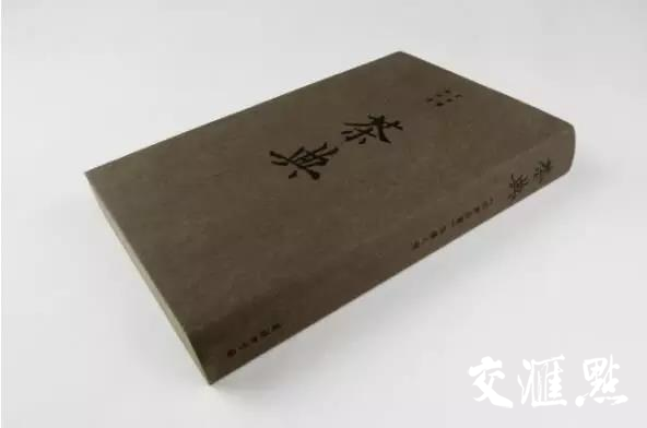
评审团在给《茶典》一书的评语中写道:“轻柔、舒顺、凝重——这本书给人的感觉就像是浓缩了的中国茶文化。封面材质选用有着天然色彩的硬卡纸。阳光下,起伏不平的表面交替闪耀着棕色、绿色和米黄色的光泽。卷首及卷尾页采用铜版纸,和封面的材质相互衬托。两页形成一个令人惊叹的完整书脊,而书中内书依然可以牢牢固定。”
The jury panel praised by saying, "Soft, supple, heavy - this book feels like Chinese tea culture in concentrated form. The rough paperboard used for the cover has a natural colour that alternates between shades of brown, green and beige, which may result from the shadow effect in the micro-relief structure. The coated endpapers at the front and back reinforce the toughness of the cover, which astonishingly forms a rounded spine while the innerbook remains straight."
在翻阅《茶典》时可以看到,“来自《四库全书》的八种古籍通过略微泛黄的超薄纸张呈献给读者,竖排字体以红线隔开,代表传统的布局。这在隔页中则有不同的表现:标题以黑色的细线分隔呈列,制造出别致的留白。隔页采用的是一种特殊的中国纸张——宣纸,纹理细腻,如丝顺滑,为书法和水墨画专用纸。隔页中还附有高清晰度的插画,两张隔页以巧妙的方式折在一起,一端较短。读者在浏览图片时要用到双手,而不是像阅读普通书籍那样翻页。这无疑减慢了查阅的速度,却也增强了阅读的乐趣。“
"And so these pages also display pictures - admittedly as high-resolution reproductions here - for which Xuan paper is intended. Their sophisticated folding with a shortened side and two sheets that are closed off at the front compels you to use your hands more than usual when looking at the pictures, instead of just turning over the pages as normal. This decelerates any examination of the book, and heightens the pleasure involved."
正如评委们所说,”书本边缘四周包裹着哑光色的金边,凸显了书中瑰宝的气质,通体散发着天鹅绒般细腻的光泽,就像刚刚经历了洗礼一般。“
"The matte gold edging all around the book intensifies the aura radiated by this gem of a book. It seems refined with a velvety, shining patina as if through ritual use," the jury panel added.
潘焰荣提到,乍一看,《茶典》的书籍整体看似没有过多设计痕迹,其实是希望把设计隐藏,不露声色地把读者的阅读体验和中国茶文化的气韵安静地融合在书籍内。温润典雅的气质,恰到好处地将茶——中国文化的经典元素呈现在世界面前。
此外,潘焰荣也谈到,在一些人看来,书籍设计只是辅助书的内容,其实文字内容和书籍设计同样重要。“设计一本书就像造一个小世界,要考虑的元素比较多,从材质到字体选择,再从色彩运用到重量感,这么多因素聚集在一起但最后又要呈现出浑然一体的效果,这就对设计提出很高的要求。”
在潘焰荣眼中,一本经典的书一定是简约纯粹的,朴素的美才是中国传统美学上的大美,怪奇用力过猛的设计也许会博得眼球但不会成为经典。潘焰荣说现在很多年轻人都追求生活方式的刚刚好,而《茶典》也正是追求和符合工艺上的刚刚好。
(来源:交汇点 编辑/汪璐)